A Pivot Table Explained
When large amounts of data need to be analyzed for your business, you need an easy way to organize that data. A pivot table makes it easier to organize and understand the information in a worksheet of “datasets.”
A pivot table is an organized statistical summary of data acquired from more extensive data-specific tables. In the world of data processing, a pivot table creates contextual and interactive data that is based on using “source data” that you flow in. This statistical summary might show you sums, averages, or other meaningful and relevant information in a manner that is easier and more intuitive to understand. A Pivot table makes it easier to see patterns and trends in your data.
Creating a Pivot Table
You can begin by preparing your data and organizing it into rows and columns, keeping all similar data in the same column. Create unique headings by formatting them differently than your data. Create a data island to separate extraneous information.
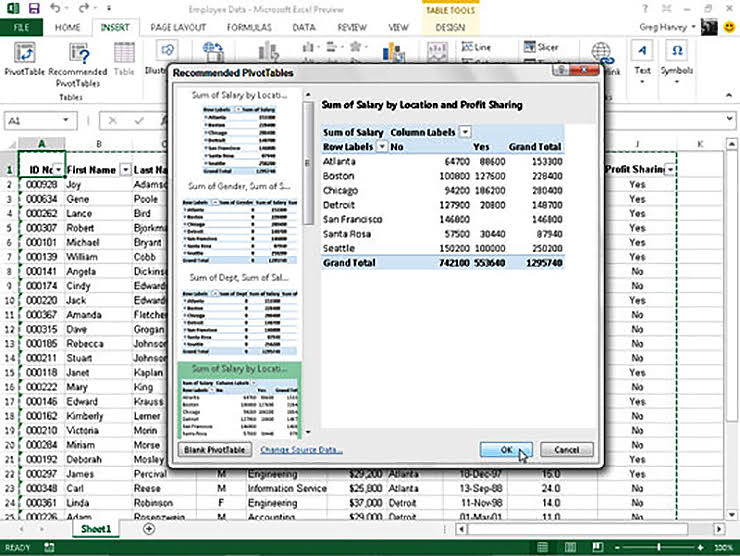
To create a pivot table, click on the Insert on the top menu items and then select either “recommended pivot tables” or just “pivot table.”

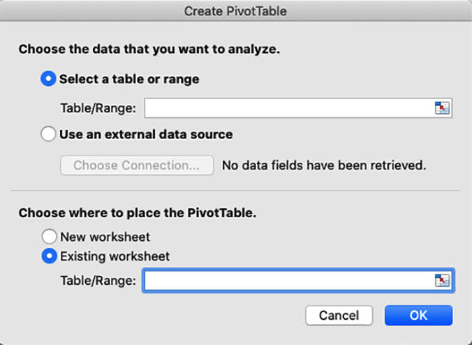
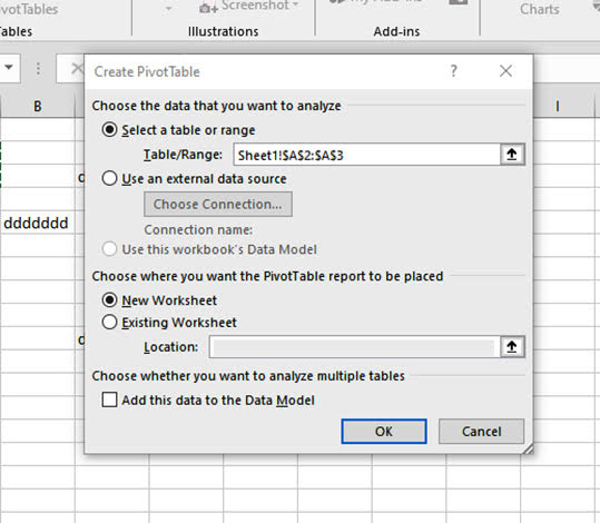
Indicate the range of cells that you intend to use, select “new worksheet” or “existing Worksheet” and then click “ok.”


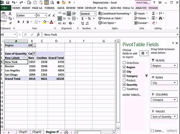
To build out your table, go to the “pivot table fields” and choose the relevant fields.

If you wish to select which values are shown, hover over a cell, then right-click and select “number format.” Then choose the category to make your changes, like how data is represented. Remember that you don’t want any blank rows or columns; it is ok to have blank cells, but not rows or columns.

The Pivot Table Advantage
Pivot tables are a user-friendly way to easily examine and determine differences in– the trends, the highs, and the lows. You can quickly utilize the report filter, column labels, values, and row labels, to view just the details you’re looking for.
Using a Microsoft Excel pivot table is a great way to organize and analyze data for your business and gain valuable insights without arduous efforts. Excel makes data analysis simpler and easier than other similar programs, allowing you to work more efficiently, saving time and money.
Data summaries are done for you. You can filter the entire pivot table with a report filter. One of the benefits of working in the excel system is that you can pull a particular kind of data out to analyze separately or for presenting to others.
Tips and Tricks
Keep data refreshed: When a pivot table is open, two tabs will appear in the ribbon (“pivot table analyze” and “design”). This is where you refresh the table and keep your data up to date. We want to add that this is not automatic, you must go to “pivot table analyze” and select refresh (or Alt + F5). For multiple tables, select “refresh all.”
If you need to update your data range often, find “change data source” and change your range. A new pivot table can be created by double-clicking on a value.
To collapse or un-collapse the details of a group of information, you can toggle the “–“ symbol.
You can change the appearance of the table and how totals are displayed by going to “Design.”
Filtering through a pivot table is easy by simply using the dropdown and selecting the category. You can also right-click on a value and select what you’d like included, even if it is not included in the table.
Pivot Tables and the Dyrand Difference
Excel Pivot Tables are part of the most powerful and most flexible business tools existing. With Microsoft 365 office and Pivot Tables, you can cost-effectively manage data and collaborate with teammates. Pivot Tables are easy to use, flexible, contains easy to summarize formatting, easily updatable, efficient, and serve as a great aid for decision making.
Just like using Dyrand Systems to manage your IT, Pivot tables are a great way to get more out of your data and boost productivity.
